PROJECT #2
SaaS B2B B2C Dashboard Design Online Advertising
👔 Managing Director — Andrew (Australia)
👨💼 Managing Partner — Tim (Australia)
🎨 Lead UX Designer — Val (Europe)
👩💻 Jnr UX Designer — Amanda (Australia)
🌍 Web Dev Team — Global Team (numerous developers)
Brief 📊
A client developed a powerful data integration formula that connects to the back-end of Google Ads and Facebook Ads, centralizing performance insights without relying on siloed analytics. While the data was accessible via Google Data Studio, they needed a digital product to make insights actionable.
💡 My Role
🔍 Research Methods – Card Sorting & User Interviews
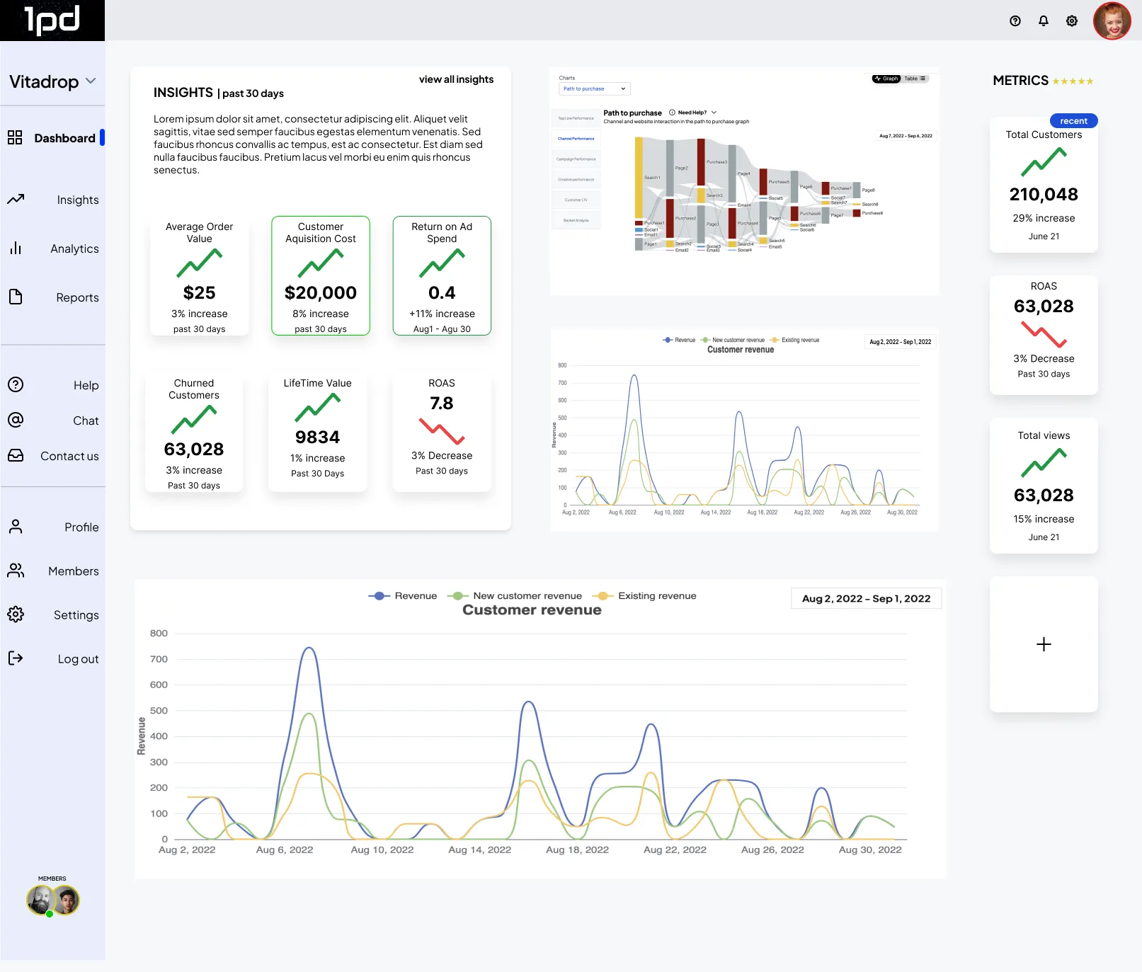
👥 User Synthesis – Persona Development
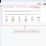
🚀 Achievements – Designed MVP 1 in just 4 weeks, leading UX alongside a junior designer. The success of this phase led to 1PD achieving a fully functioning digital product ahead of time.
Research Methods 🔍
📝 Card Sorting – Simplifying Complex Data
The client’s dataset contained 65 categories with a complicated structure. Through information architecture, I identified an opportunity to enhance user navigation and data interaction. My goal was to determine whether users understood the existing categories and how they naturally grouped the information.
📌 Approach:
✅ Conducted online card sorting via Optimal Workshop
✅ Askable was used to recruit targeted Australian users
🚧 Challenges & Solutions:
🔸 Recruitment was slow due to the specific user profile, so I used the waiting time to design the interview guide for the next research phase.
🔸 The client was skeptical about investing in card sorting, so we started with a small sample size. Once they saw the results, they recognized the value of UX research.
📊 Results:
✔ 25 participants sorted 65 cards, leading to new, user-friendly categories
✔ None of the original category names made sense to users, requiring restructuring
✔ A new category emerged, reshaping the information architecture
🎯 Impact:
This research was crucial for creating a user-friendly platform, allowing both the UX team and the client to implement intuitive navigation for complex data.
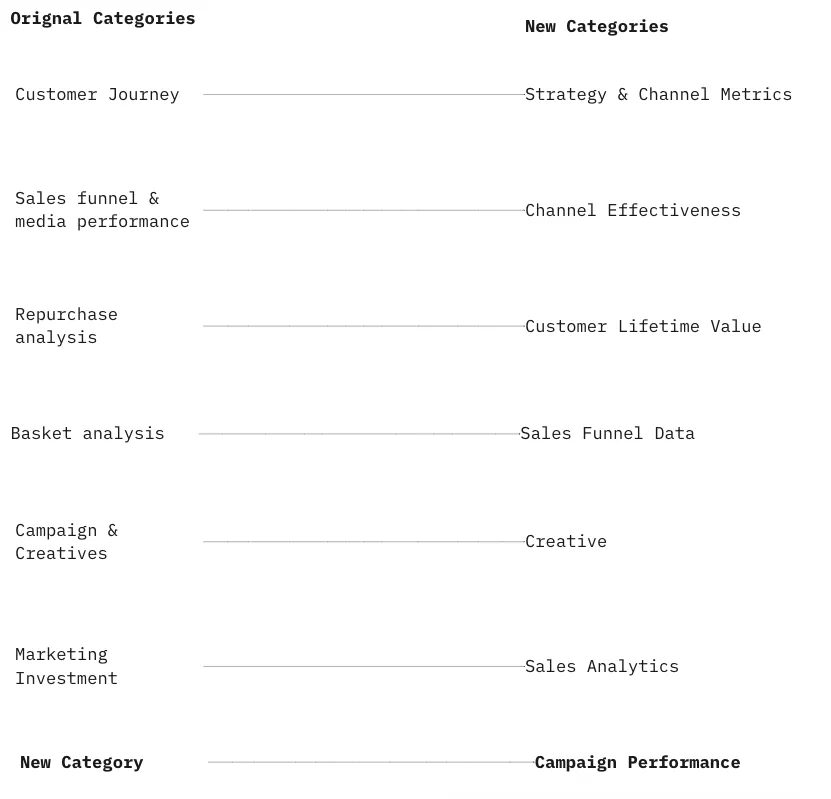
📝 Categories that made sense to the user
On the left were the original main categories and on the right were the new categories. The subcategories also changed significantly. A new category was also discovered
I also took the opportunity to use the card sorting to speak to our users, I asked questions before and after the card sorting to get some insights. Here are some of the results below. Interpreting data seemed to be of most concerning to users.

🔍 Hypothesis
Our digital solutions aim to address specific problems.
⚙️ Requirement
Real-time access to information.
🎯 Objective 1
Accurate data retrieval and streamlined report generation.
📊 Objective 2
Simplifying data comprehension, eliminating the need for extensive analysis to derive insights.
⏱️ Need
Information available live/instant.
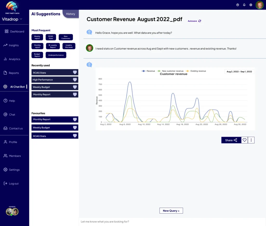
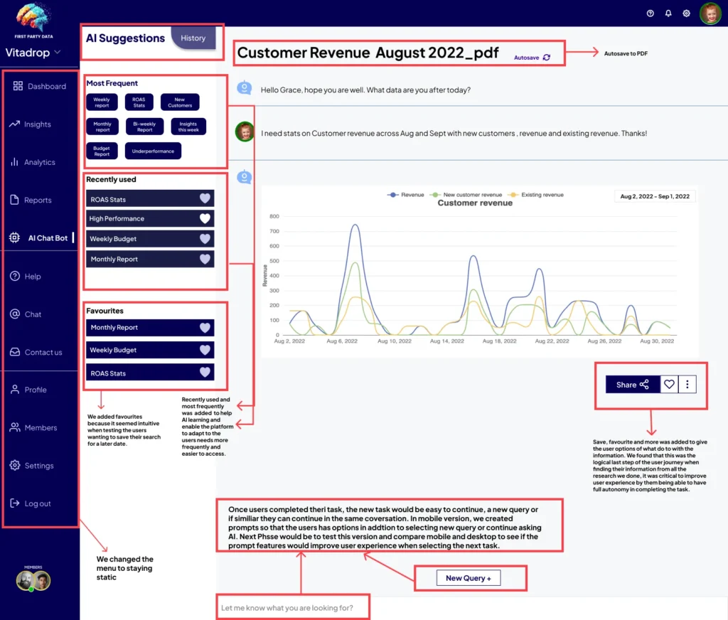
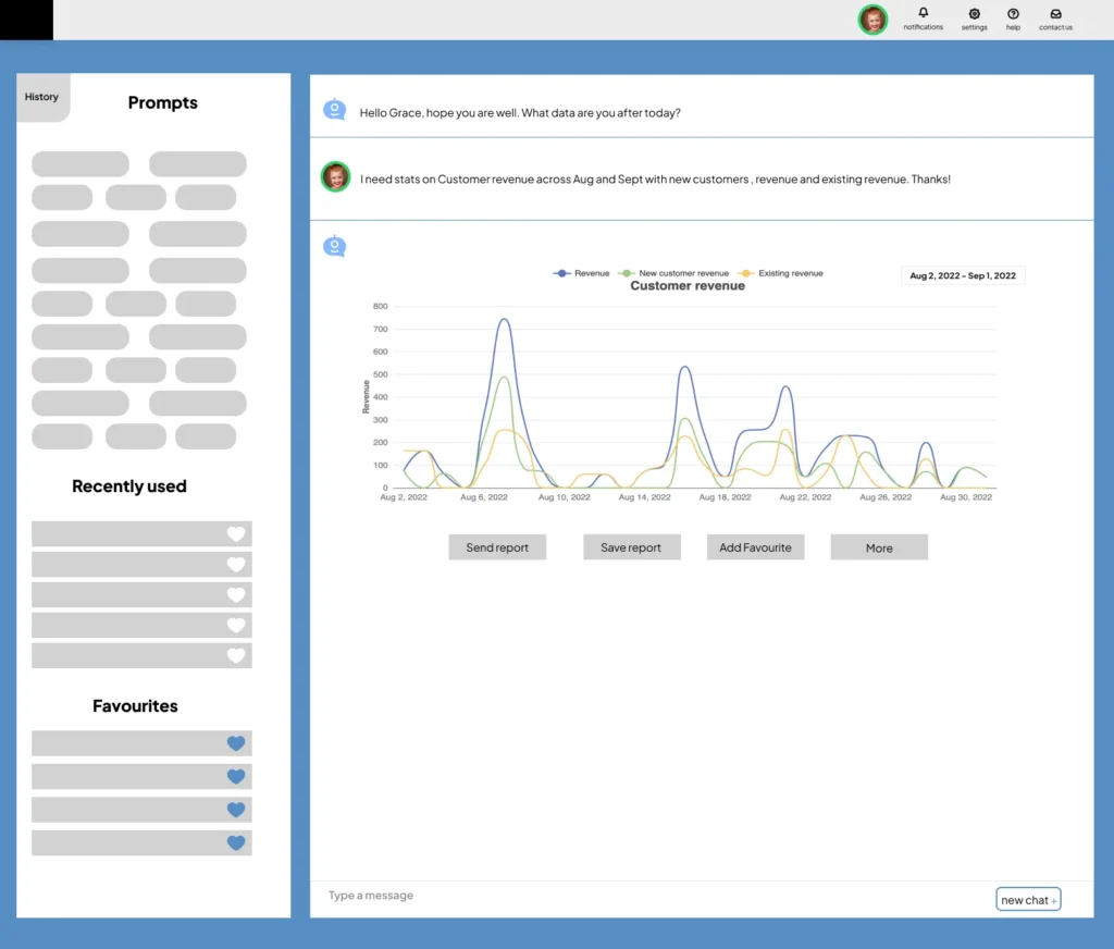
AI integration in marketing campaigns simplifies complex data and reduces cognitive overload, allowing users to access insights instantly. User feedback led to the addition of an AI Chat Bot, giving users real-time answers while maintaining control over their dashboard and giving digital marketers more time to make campaign decisions and minimise resource waste.

