The goal was to redesign a mobile POS payment flow to streamline transactions, reduce calls to the customer support center, and enable users to complete their financial tasks with ease.
Hypothesis:
Users find it overwhelming to complete simple transactions such as transferring funds, adding funds, or requesting funds due to a cluttered and unintuitive design.
Research Insights: From our research, we discovered that many mobile POS systems are poorly structured, leading to:
Slower checkout processes
Higher abandonment rates
Increased call center inquiries, resulting in higher operational costs
User Testing & Key Findings: Our design team conducted usability tests on the existing interface to evaluate how users performed the following tasks:
Transfer funds
Add funds
Request funds
User Testing Results (n=28):
19 users initially clicked the correct section, but within that section, there were two competing links:
Top link: “Go to Spending & Income”
Bottom link: Account number with available balance (where the transfer funds option was located)
Many users expected to find the transfer function in a more prominent and intuitive location
The existing layout was not optimised for quick transactions, causing user frustration
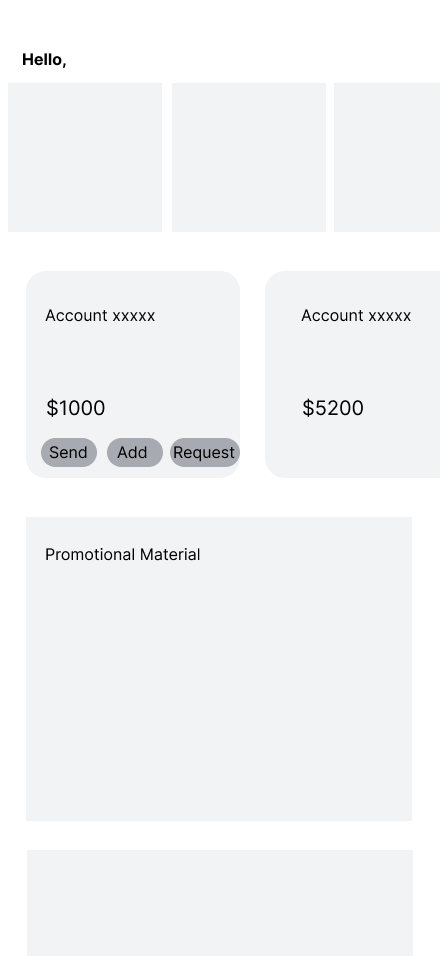
Mockup 1:
Introduced additional buttons in the account box
Issue: Buttons were too small on mobile, making them difficult to tap
Result: The design felt cluttered and unintuitive
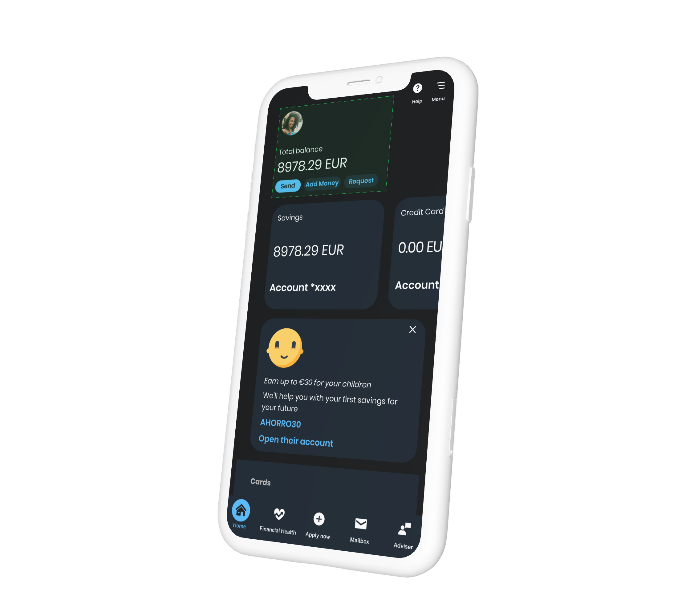
Mockup 2 (Final Selection):
Featured larger icons for better usability
Placed key actions at the top of the hierarchy for better visibility
Integrated into the navigation bar for easy access
Result: All users successfully completed transactions with minimal confusion
Challenge: While this redesign meant removing the “Financial Health” section from the home screen, it remained accessible in the navigation bar, ensuring its continued visibility.
Final Redesign & Next Steps:
The refined design was moved to high-fidelity prototypes and prepared for further testing to validate improvements.
Next Steps:
Continue usability testing to refine interactions further
Explore additional improvements based on user behavior and feedback
Investigate users’ purchasing habits, banking priorities, and saving goals for future redesigns
This UX redesign not only enhanced the mobile POS experience but also demonstrated how thoughtful design decisions can significantly impact user satisfaction and operational efficiency. Stay tuned for future insights as we continue to evolve the banking experience!